Hello everyone —
I’m Matthew Wolff, a graphic designer and one of the co-founders of Vermont Green FC. It’s nice to meet you all! You’re probably here because you noticed the release of the Vermont Green FC crest. My fellow co-founders encouraged me to give you, dear reader, a peek behind the curtain into my process of designing this crest.
So here ya go:
When I’m not attempting to start a soccer team with my friends, my “day job” is designing soccer crests and jerseys for clubs around the world. Design and soccer are my two big passions, so to blend them into a career has been a dream come true. I’ve worked with clubs from New York, Chicago, and LA to France, Nigeria, and Malaysia to capture the spirit of their club and community through design.
As you may know, Vermont Green FC is a brand new minor league lower division soccer football club. My friends and I decided to start the club to provide the highest level of men’s soccer in the beautiful state of Vermont and to normalize environmental justice in the world of soccer. We believe soccer can be a powerful catalyst for a more environmentally-sustainable and socially just world.
I believe that the best football clubs reflect their communities and that the best crests accurately capture that reflection. Vermont has a long history of prioritizing environmental stewardship and community bonds. Folks are eclectic and resilient and love to get together. It was my job to try to capture that in a crest.
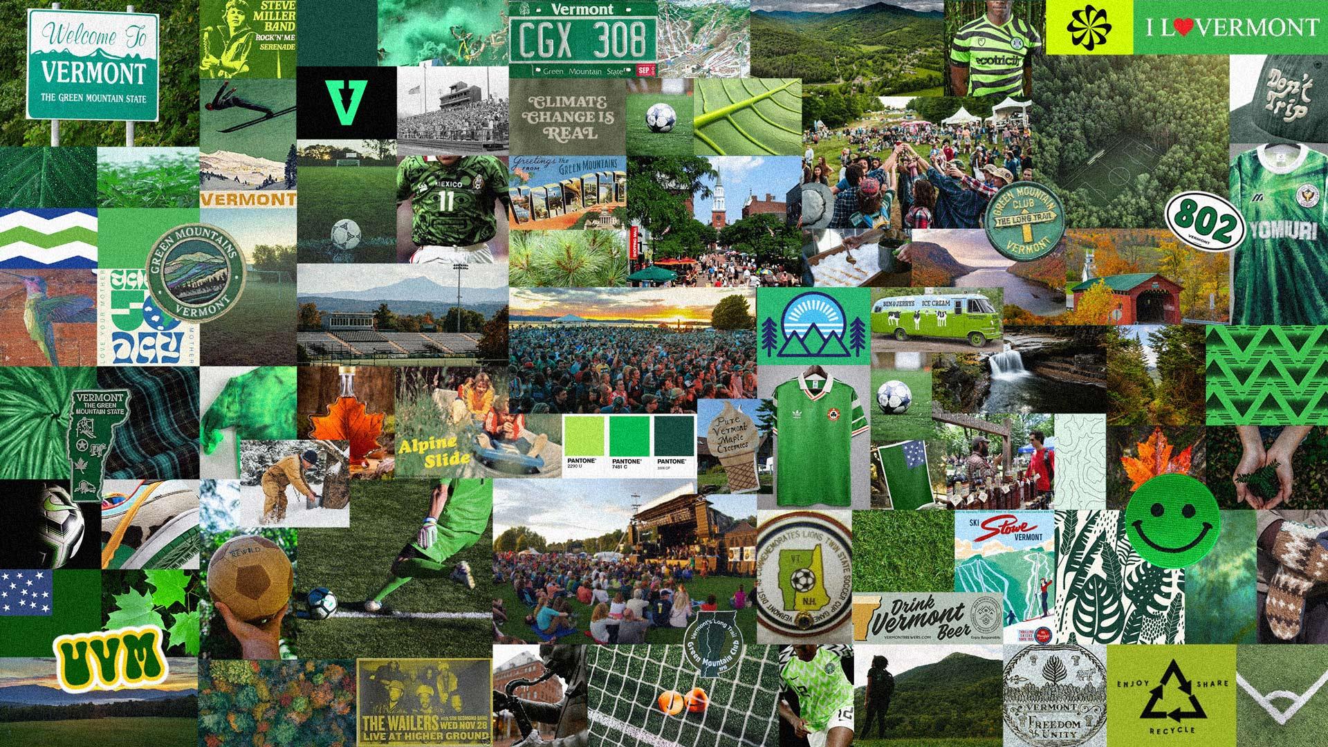
Back in 2020, when my friends and I decided to start this club, one of the first things I did was put together this mood board. This would start to shape the club’s visual aesthetic.
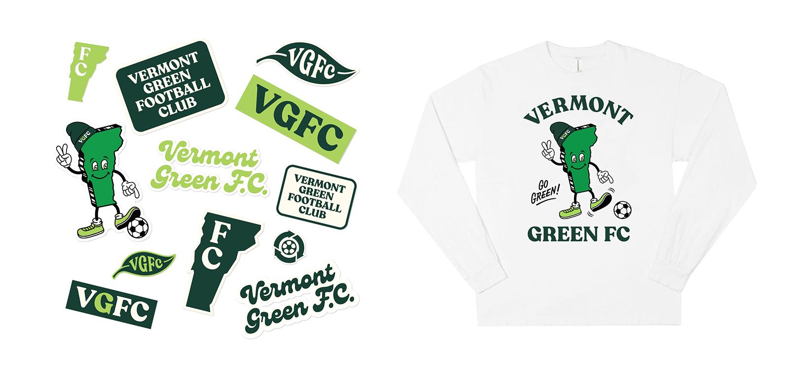
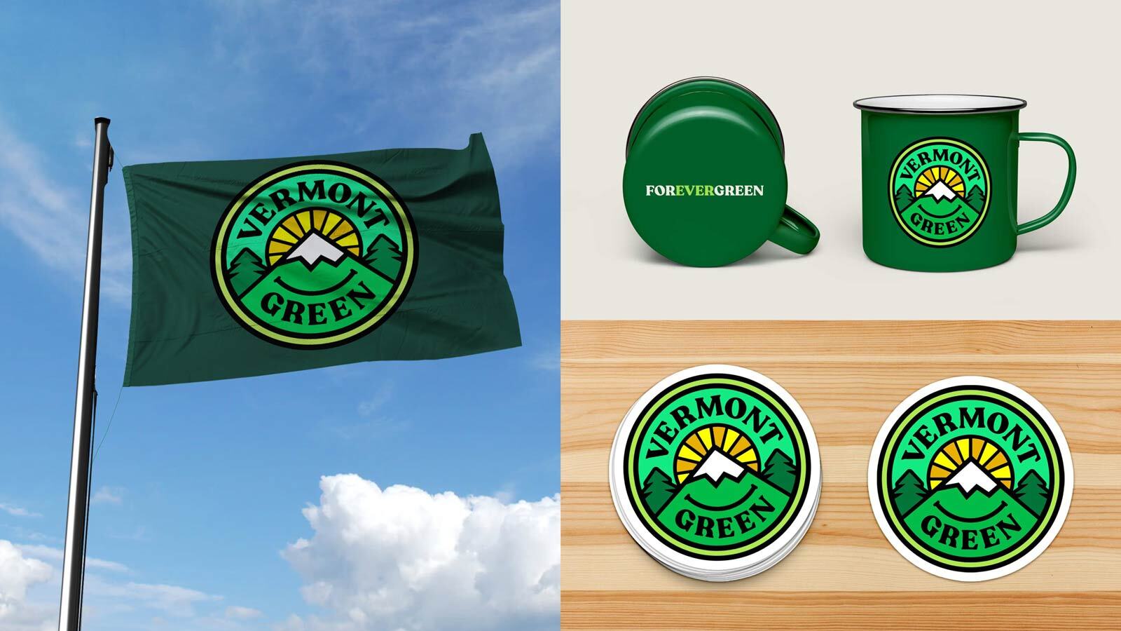
A few months later, I designed graphics for stickers and t-shirts for the club launch. They proved to be functional and fairly popular, so we wanted the crest to fit within this visual identity — through color, typography, style, and vibe.
We needed a crest that would capture the spirit and purpose of the club. We wanted it to:
- celebrate the natural beauty of Vermont (imagery like pines and/or mountains).
- capture the joy and human connectivity that the beautiful game of soccer brings to the world.
- be predominantly green.
- get a little funky. This is minor league sports. Why not have some fun with it?
So I cracked open the sketchbook, and got sketching:
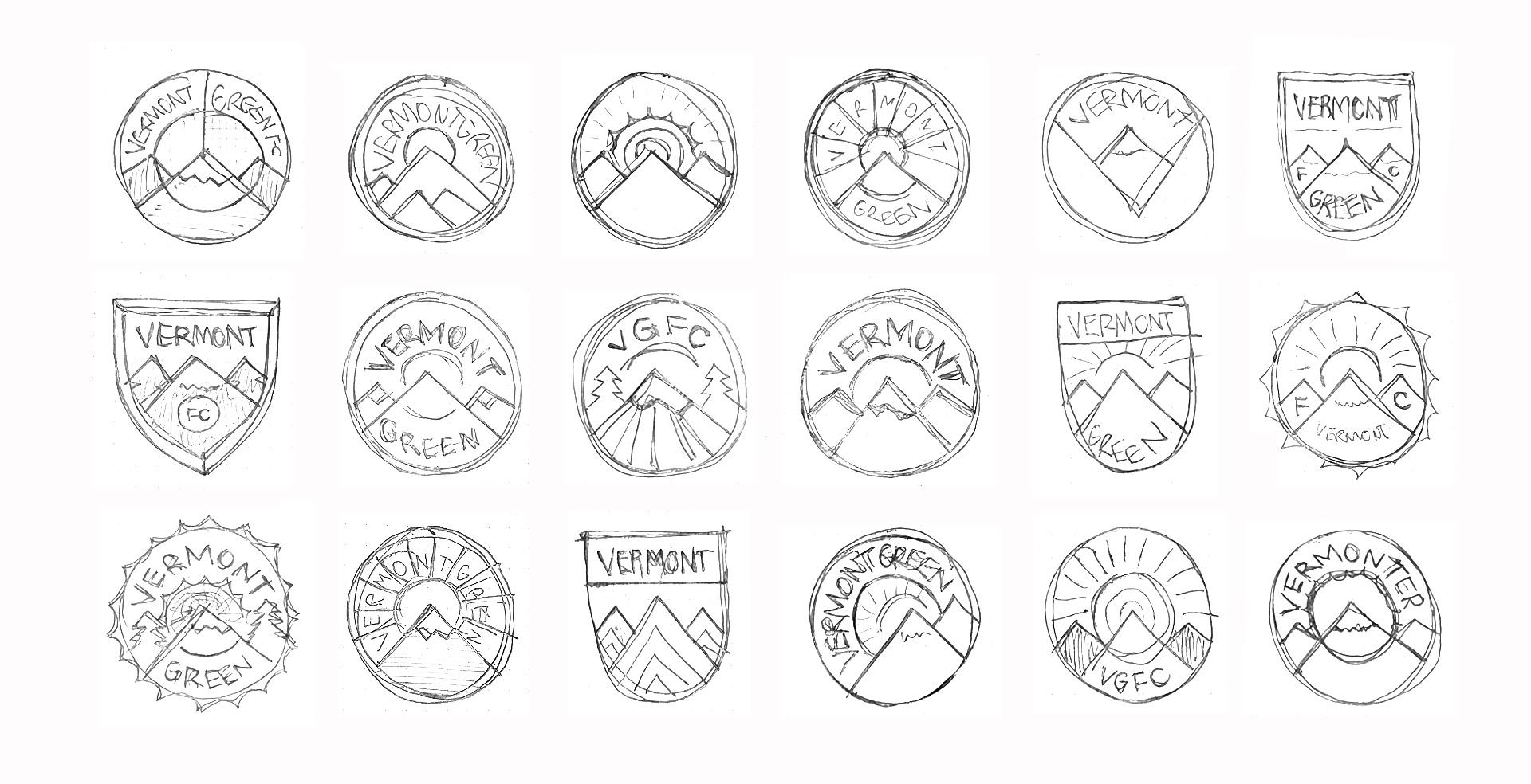
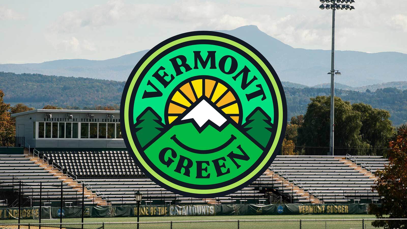
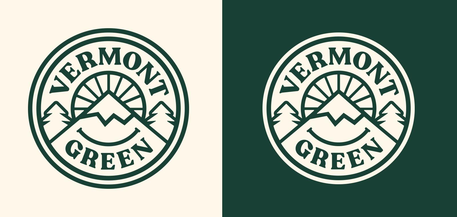
I messed around with various shapes and compositions until I found something we thought could work: a circular crest with VERMONT on top, GREEN on the bottom, trees, mountains, and a sun. I fired up the computer and started building the crest in Adobe Illustrator.
We opted not to include any overt soccer imagery or the letters ‘FC’ or ‘FOOTBALL CLUB’. We did this because our club’s mission goes beyond soccer. We hope that in supporting this club, you’re supporting something bigger than what’s happening on the pitch.
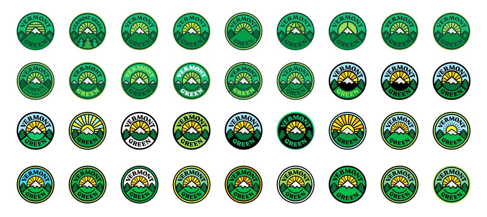
The bulk of my design process is iterating on an idea that I feel has potential. For this crest, I must have made a couple of hundred iterations that we eventually narrowed down to two:
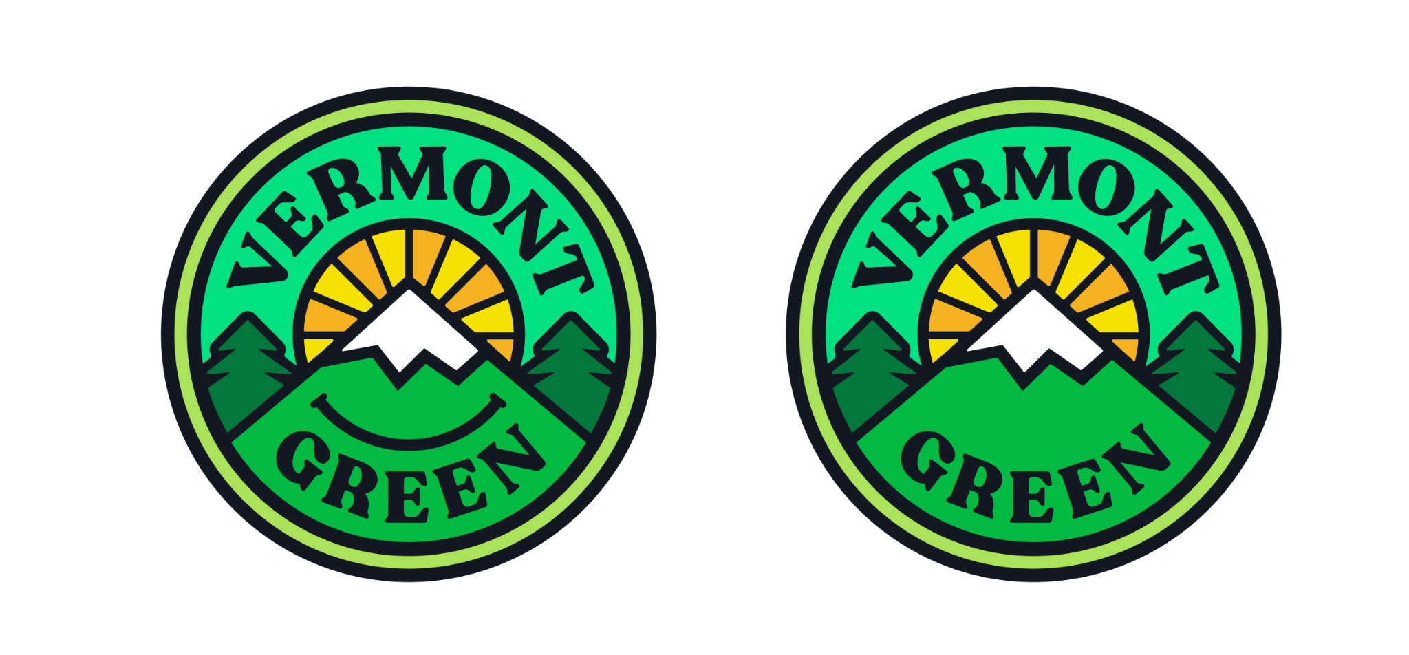
The only remaining question: to smile or not to smile? It seemed a bizarrely big deal. We asked friends and community members before deciding to go ahead with it. We felt it exuded optimism and underscored that we are part of our natural environment.
Don’t get me wrong: we take the game seriously. Coach Adam and his staff are working tirelessly to assemble the top players in the state and talented players from across the country. But we’re having fun building this club, and hope you’ll join us.
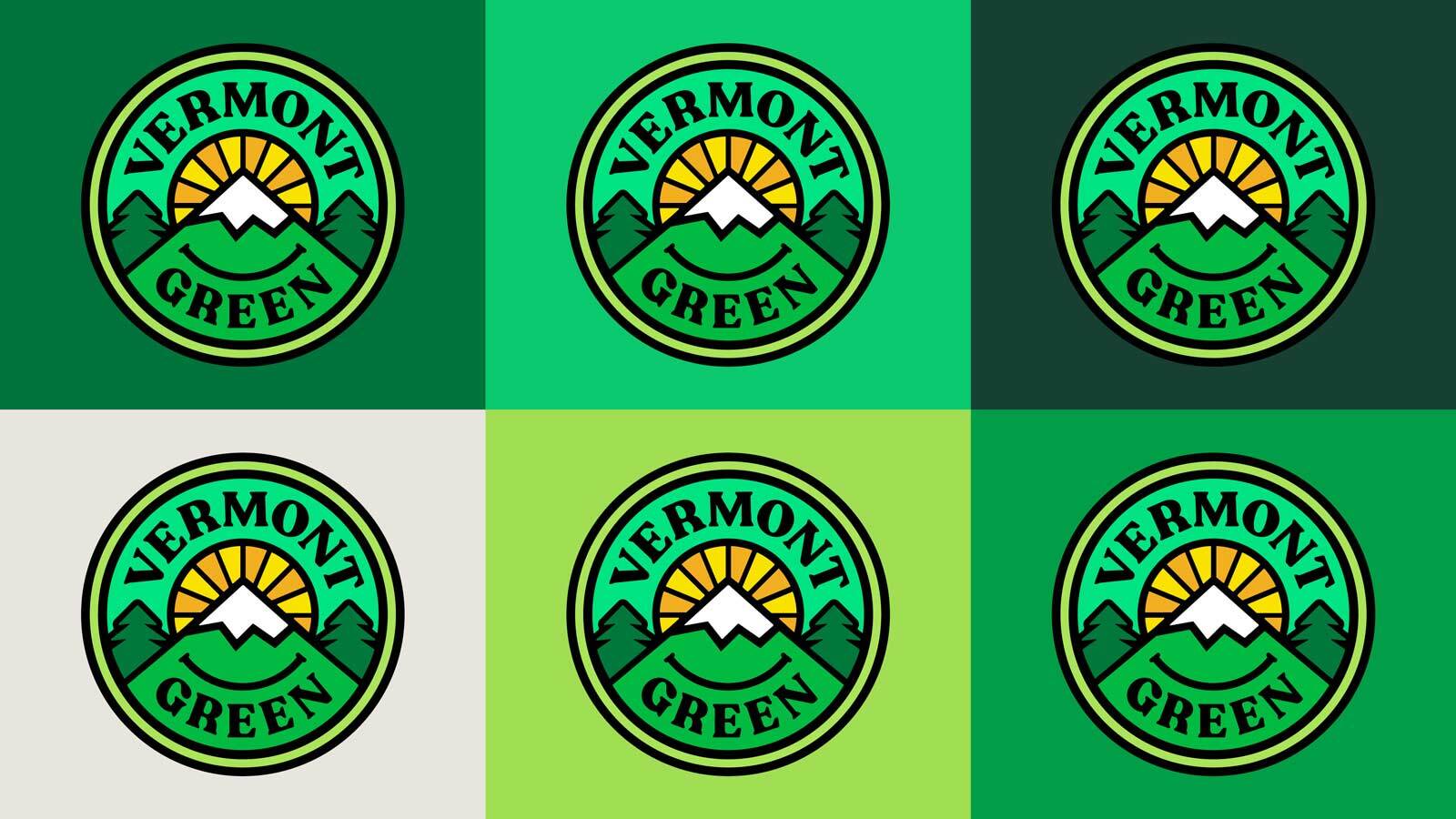
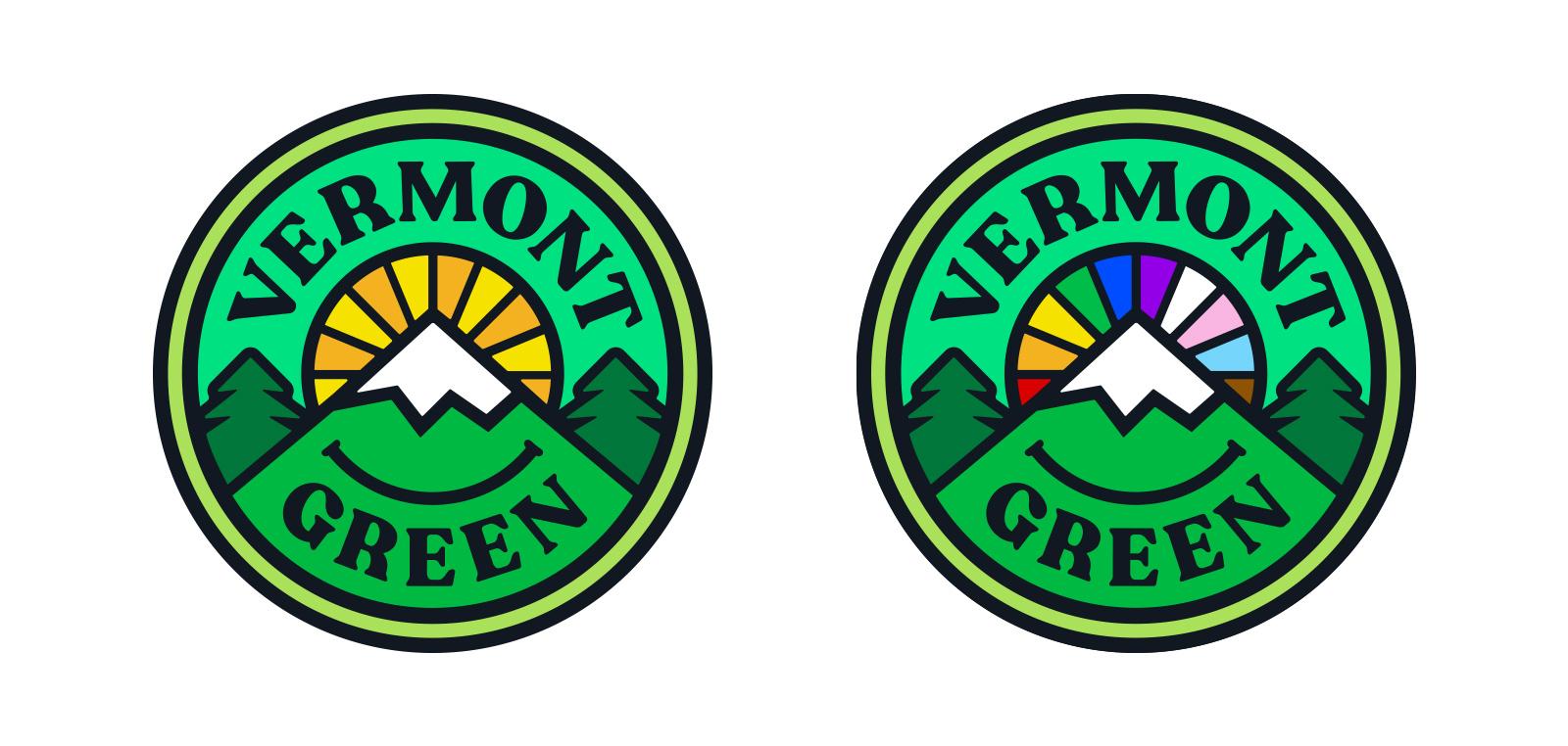
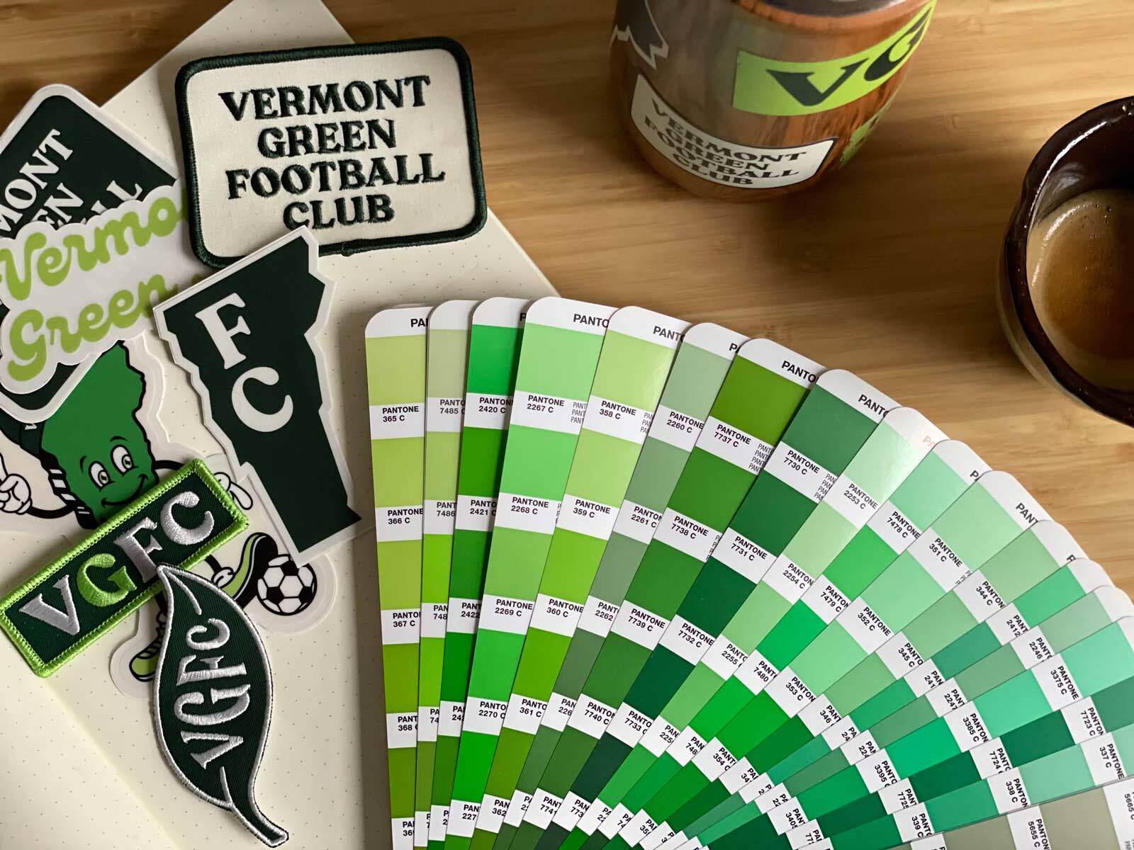
There are over 300 shades of green in the standard Pantone book. Vermont Green FC has approved every one of them.
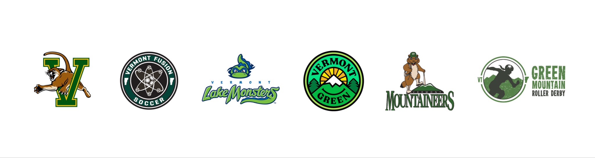
Among our friends in Vermont. A good amount of green logos here. We love that.
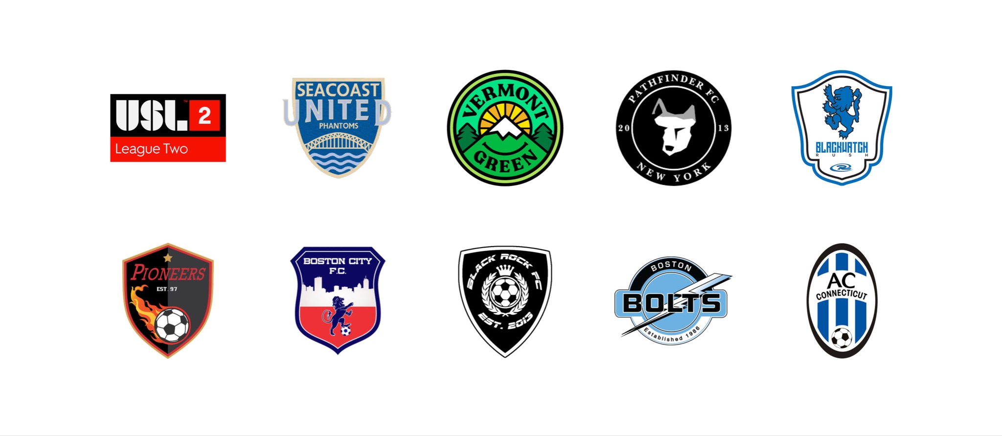
Among our competition in the USL League 2 Northeast Division. Wasn’t much green here until we showed up. Our season runs from mid-May to mid-July and we play most of these clubs both home and away. Check out our 2022 schedule.
Brent Burdick (aka Townbench) offered his animation services to bring this crest to life. We didn’t have the budget to film anything, but Brent made it work using only stock footage. Thank you, Brent!
So there you go. A little peek behind the curtain. If you like it and are needing a new t-shirt, you can grab one here. We also have this white one which is just asking to be tie-dyed green.
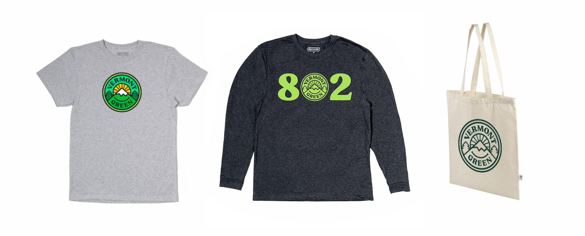
If you don’t need new clothing, we’ve got stickers, totes, and mugs. Our season ticket, which gets you into every home game (including friendlies and playoffs), is just $65.
I know this letter has mostly been around branding a soccer club, but if you take away nothing else, remember this: we’re part of our natural environment. Our well-being depends on its health, and marginalized people are disproportionately harmed when we abuse our environment. In taking care of nature, we take care of one another — something our society desperately needs more of.
Have a great rest of your day 🙂
Matthew